CSS
17. 미디어 쿼리를 이용한 종합 예제
HJ76
2023. 4. 2. 01:04
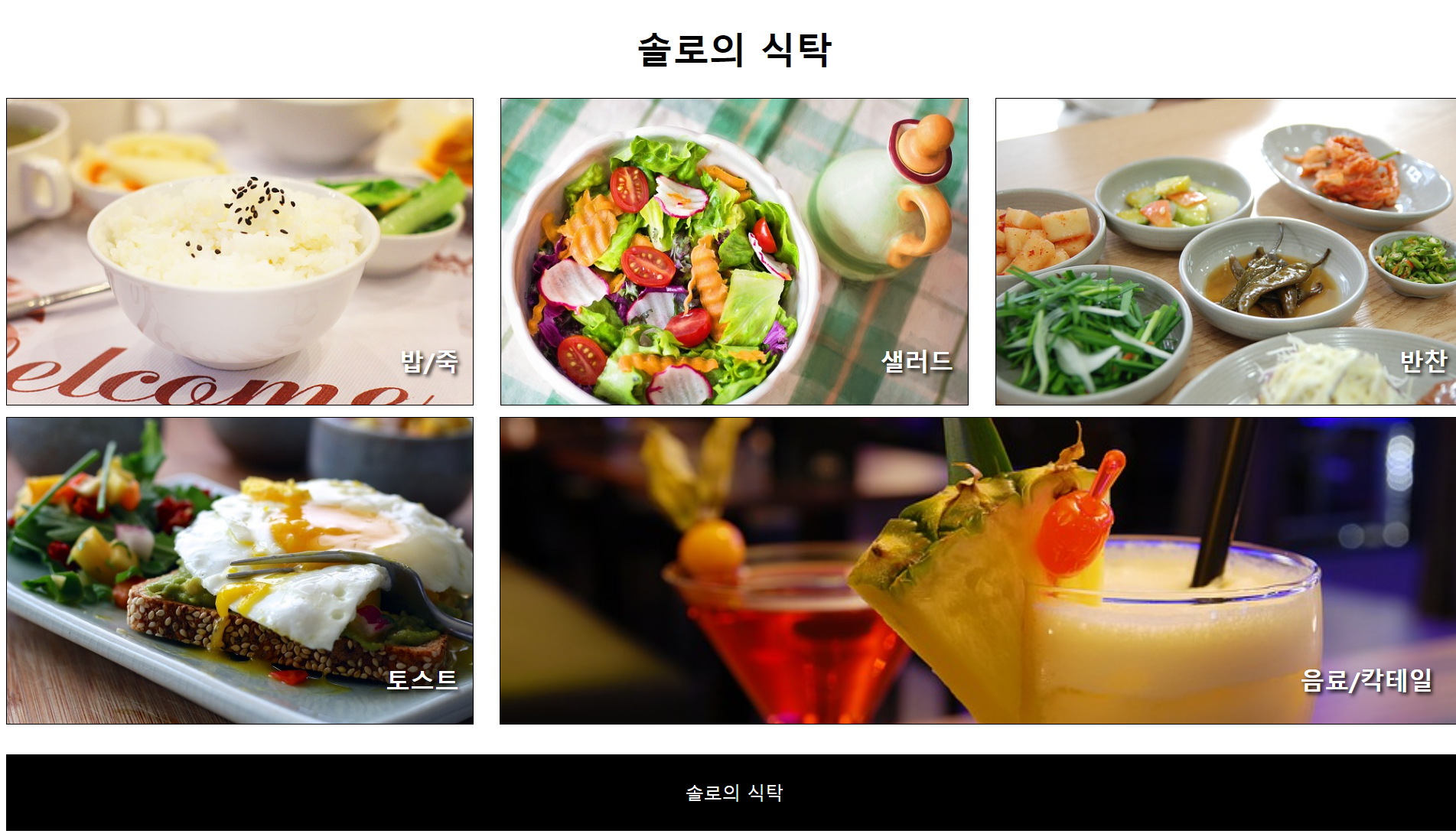
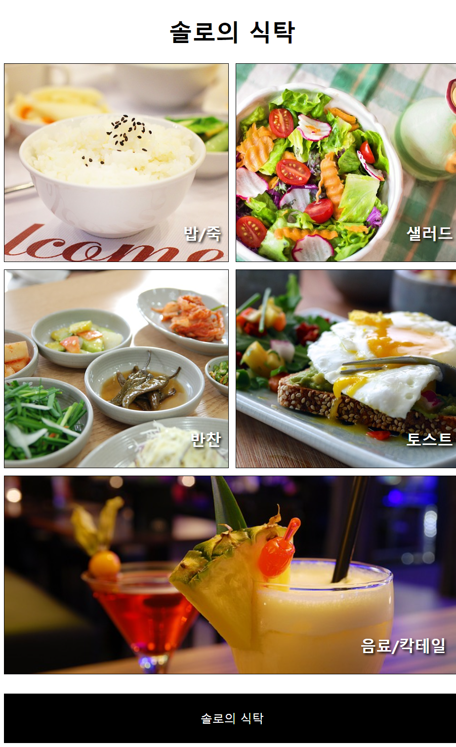
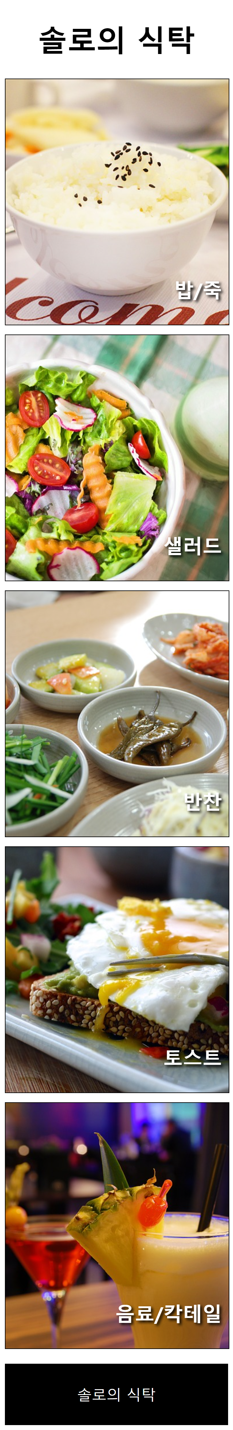
솔로의 식탁
HTML
<!DOCTYPE html>
<html lang="en">
<head>
    <meta charset="UTF-8">
    <meta http-equiv="X-UA-Compatible" content="IE=edge">
    <meta name="viewport" content="width=device-width, initial-scale=1.0">
    <title>솔로의 식탁</title>
    <link rel="stylesheet" href="css/style.css">
</head>
<body>
    <div id="container">
        <header>
            <h1>솔로의 식탁</h1>
        </header>
        <section id="menus">
            <div id="menu1">
                <h2>밥/죽</h2>
            </div>
            <div id="menu2">
                <h2>샐러드</h2>
            </div>
            <div id="menu3">
                <h2>반찬</h2>
            </div>
            <div id="menu4">
                <h2>토스트</h2>
            </div>
            <div id="menu5">
                <h2>음료/칵테일</h2>
            </div>
        </section>
        <footer>
            <p>솔로의 식탁</p>
        </footer>
    </div>
</body>
</html>
CSS
#container {
    width: 100%;
}

header{
    width: 100%;
}

header > h1{
    text-align: center;
    font-size: 3em; /* PC:16px * 3, Mobile:12px * 3 */
}

#menus{
    width: 100%;
}

#menus > div{
    height: 400px;
    border: 1px solid black;
    margin-bottom: 15px;
    position: relative;
}
#menus h2{
    position: absolute;
    right: 3%;
    bottom: 10px;
    font-size: 2em;
    color: white;
    text-shadow: 3px 3px 5px black;
}

#menu1, #menu2, #menu3, #menu4, #menu5{
    width: 100%;
}


#menu1{
    background: url(../images/dish1.jpg) no-repeat center;
    background-size: cover;
}
#menu2{
    background: url(../images/dish2.jpg) no-repeat center;
    background-size: cover;
}
#menu3{
    background: url(../images/dish3.jpg) no-repeat center;
    background-size: cover;
}
#menu4{
    background: url(../images/dish4.jpg) no-repeat center;
    background-size: cover;
}
#menu5{
    background: url(../images/dish5.jpg) no-repeat center;
    background-size: cover;
}

footer{
    width: 100%;
    background-color: black;
    height: 100px;
}

footer > p{
    font-size: 1.5em;
    color: white;
    text-align: center;
    line-height: 100px;
}

@media screen and (min-width: 768px ) {
    #menus{
        display: flex;
        flex-wrap: wrap;
        justify-content: space-between;

    }
    #menu1, #menu2, #menu3, #menu4{
        width: 49%;
    }
}

@media screen and (min-width: 1024px){
    #menu1, #menu2, #menu3, #menu4{
        width: 32%;
    }

    #menu5{
        width: 66%;
    }

    /* #menu5{
        flex-basis: 0;
        flex-grow: 2;
        flex-shrink: 1;
        margin-left: 1.7px;
    } */
}